This is the Blog of artwork by Martin Davey. The artwork is a mixture of digital illustrations created in Photoshop, and paintings created on canvas using oil and acrylic paint media. The entries give some idea of the dates of completion, and influences and inspirations if any. The work is not listed in any particular order or time frame though generally the more recent work is at the start of the blog. My two main websites are www.martindaveyfineart.co.uk, and www.martindaveyillustration.co.uk.
Monday, 27 April 2009
dinosaurs out shopping
Dinosaurs are of constant interest to most people because of their unusual size and looks compared to todays animals. It seems fun therefore to place them into mundane human situations, as here illustrated with a mother and son out on a shopping trip walking along a sidewalk. The boy is a typical boy, dressed in his favorite football colours and kicking a ball, the mother by his side with a basket for shopping, but they are both biped dinosaurs, and a nearby shopkeeper is a triceratops. The shop itself is very ordinary, almost old fashioned but has 'dinosaur' language on the price cards. The dinosaurs themselves are not technically accurate, but are slightly cartoony and friendly, and modifiyed so that they can wear cloths. The composition is nothing special and shows up the details easily. The illustration is painted in photoshop to a size of 10" x 8". Other dinosaur world paintings are here and here. Painted in 2009.
Wednesday, 18 March 2009
supermarket horse serving animal customers
 SUPERMARKET HORSE
I find it amusing to think of animals in human roles and have visited this area several times as seen here on this site. The illustration shows a scene in a small shop with a horse acting as a cashier. She is serving a devious looking crocodile and snake friend some cigarettes and beer. Outside of the shop can be seen ordinary members of 'animal' society going about their business. A mad monkey can be seen looking out of the window of the building opposite. The cashier can be seen in a animal supermarket view elsewhere on the site.
Painted in 2008 Time Keeping Victorian Inventor

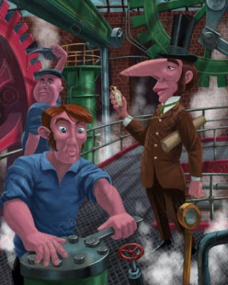
VICTORIAN INVENTOR
This was painted a few days before this post,in march 2009. It is a small size at 4x5 inches at300ppi.My inspiration was watching 'the Victorians' documentary on BBC tv, particularly with the hair styles (side burns)!from the website.....
This digital illustration is a nod to the industrial revolution of Britain in the 1800's. It is quite stylized, with the perspective distorted throughout and the characters are also stylized. The main character is the chief inventor, with drawings and plans under his arm. He is checking the efficiency of his workforce using the steam power technology of the time, by consulting his stopwatch The other members of the work force carry on with their duties. The main source of lighting is coming from above and the beams in the roof are cast shadows throughout the scene.
Painted in 2009.
Labels:
brunel,
engineering,
illustration,
invention,
machine,
tophat,
victorian
Monday, 9 March 2009
Animals On A Tube Train Subway Commute To Work
 ANIMAL TRAIN COMMUTE
Painted in photoshop at A4 size, this is an entertaining collection of animals going to work. The interior of the train is based on a central line underground train. I wanted the passengers to do normal things that commuters do, ipod etc, and liked the horse with hooves operating a laptop. If the scene was slightly wider I would have had water on the floor around the base of the seals tail. Painted dec 2008.from the website...
Traveling on the London Underground was something I did for over ten years. It was a only a matter of time before I decided to put animals in to replace humans in this normally mundane routine for many. Over half of the underground system is overground but an African savanna view like this outside would be very rare. The illustrated cartoon animals seen on their daily commute here are lions, an elephant, seal reading newspaper, cows, crab, horse typing on laptop, fox with ipod,rhinoceros reading paper, monkey hanging from hand rail, giraffe and a crab carrying its briefcase on its shell. It is painted in photoshop to A4 size and took about a 5 days to do. The original drawing is done on the computer using a drawing tablet, and then painted electronically using traditional painting techniques. The inside of the carriage is based on a central line train.
Mother And Son In Garden

MUM AND SON IN GARDEN
This is painted at a size of 4x5 inches,so is smaller than usual. It is painted in a stylized way with a heavy'wide angle',and the treatment of the faces is particularly stylized. The perspective is very forced and cheated for impact.
from the website...
A mother is seen outside her family home with her son, by the front gate. The digital illustration features stylized characters and elements. The perspective is heavilly distorted to show the figures in relation to their environment.
Painted in 2009
Sunday, 1 March 2009
Richard of lionheart
 RICHARD LIONHEART LION
This was done in A4 size in dec 2008. I wanted to show a confrontation, in a humorous way, between two strong forces, but one good and one evil. The idea, and the composition came very quickly, and I wanted the sky to be dramatic and have strong, violent colours.from the website...
Richard of Lionheart, seen as a proud and strong Lion is about to enter battle with a nasty crocodile as his enemy. The composition allows both characters to be show, but with the stronger Lion king in a prominent and dominant location. The sunset indicates warfare and the tree possible death to the looser.
Painted in 2009.
Thursday, 26 February 2009
spider with fly having a picnic on web
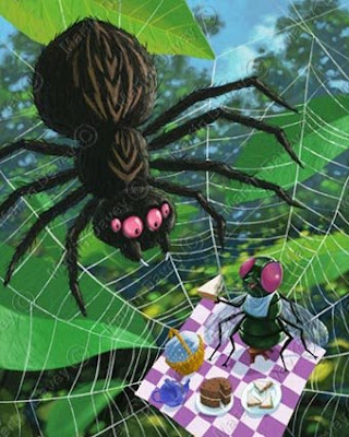
 SPIDER WEB PICNIC
This was painted in 2007 and is loaded with 'dark humour'. The fly is quite happy eating his sandwich and is offering some to the spider. It is difficult to say if the spider will have some sandwiches for lunch, or have the fly for lunch. I experimented in this image of painting the background out of focus, like a photograph of a real spider on a web.from the website...
This is perhaps a slightly frightening image to youngsters and is quite dark in its tone. The fly is having a little, sweet picnic on a spiders web. The large spider has appeared on the web and it is up to the imagination of the viewer what happens next. Does the fly get eaten or does the spider join in the picnic? I have gone for a very flat on, unrealistic perspective here, basically for styling and clarity in the image. I particularily enjoyed painting the food! The background was painted out of focus as if seen through a camera. The painting is created in photoshop to a size of 10" x 8".
Sunday, 22 February 2009
Romantic Snails On A Date
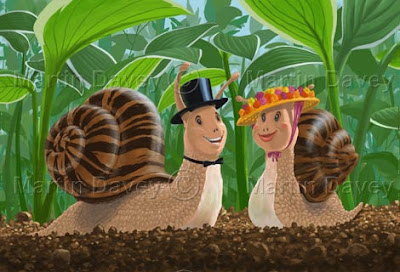
 SNAILS IN LOVE
Snails in love is an early image of mine, painted about 2006. I was very much in to gardening at the time, and liked to grow 'hosta' plants, featured here in the background.from the website...
Two romantic snails are seen on a date in the undergrowth in this digital illustration. They have early 20th century hats on, but no other clothing. The undergrowth is made up of 'Hosta' plants, favorites of snails and slugs.
Painted in 2007.
hotel rhino and porter fox
 RHINO ENTERING HOTEL WITH PORTER FOX
 This painting was done A4 size at 300pp1 in december 2008. It continues the theme of animals in clothing. This time i wanted to contrast the size , and personality, between two animals. The Rhino here is powerful and bullish, being a business man of some sort, whereas the porter is eager to please and just gets on with the job. I wanted him to struggle with the big baggage as well. The edwardian clothing adds more interest in to the impossible scenario in this painting. The shiny floor was fun to do, as was the detail of the Rhino face and fox face. from website...This painting shows what typically would be a mundane human activity,
but replacing the people with animals. I was drawn to the idea of using a
Rhinoceros and a Fox as they are so different visually in size and
texture. The Rhino is large and bully, like an angry business man
whereas the little fox is so small and friendly in comparison. It is
difficult to believe that the fox could even lift the suit cases up. The
edwardian setting adds to the idea of a more delicate era, in which the
huge rhinoceros is strolling throught like a bull in a china shop. The
delicate monocle on the creature adds to the bizzare spectacle. It was
nice painting the two conflicting characters and also the brass fittings
on the floor. The painting is done in photoshop to A4 size.
Saturday, 21 February 2009
Little Happy Pigs On Train Journey

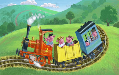
DAY TRIP FOR PIGS ON RAILWAY
This painting dates from 2005, and is one of the earliest photoshop illustrations of mine on the internet. I enjoy painting 'eccentric' railway locomotives, and I wanted to, at the time paint a picture which is clear and cute to the viewer. I have built in unrealistic curves in to the train track, hills and clouds.
from the website...
This is a very early digital painting, possibly the second one produced. The illustration shows some pigs on a day trip riding on a train in the countryside. The engine is a red steam engine, driven by a happy pig driver. The passengers are happy as well looking at the scenery, though one of them is busy reading a newspaper. I did intend to redraw this at a larger resolution, but the image changed in to another, similar illustration instead.
Labels:
animals,
children,
countryside,
cute,
engine,
fun,
locomotive,
railway,
steam
Bus queue in the rain
 BUS QUEUE IN THE RAIN
This is an older painting of mine, done in Photoshop during 2006. It is quite cartoony, with the characters having black spots for the eyes rather than fully painted ones. There is quite a lot of dark humour in this image, particually with the cat right in front of the bus wheel, about to be run over. Also in the fact that the woman is in difficulties and her plastic shopping bag has split, with some of the contents spilling out. A surreal touch is the monkey on the top deck. I did wonder about giving the bus a 'disapproving' face, but the headlights seem to work as eyes anyway!
I was thinking of 'Reg Varney', from TV's 'On the Buses' when drawing the bus driver.
from the website...
This was digitally painted in 2008 in photoshop at 10"x8" size. The scene depicts a rainy, depressing day in the UK with various accidents awaiting to happen, like the shopping bag about to break or the cat about to be run over. The bus driver is sitting smoking a cigarette, and could not care less. The monkey adds a bit of surrealism. The rain and the reflections were fun to explore and the red double decker bus is not a london bus but a made up one. It could be argued that the headlights on the bus are eyes! The crinkled destination blind and number in the wrong place are something that I am reminded of when I think of these old types of buses.
Labels:
comic bus,
On the Buses,
painting,
people getting on bus,
queue,
rain,
red bus,
weather
Friday, 20 February 2009
Romantic Victorian Pigs In Snowy Street
 ROMANTIC VICTORIAN PIGS
This is one of my favorite images completed in november 2008. it is painted A4 size at300 ppi, and took about 2 1/2 days. I had the idea while watching "little dorrit" , the BBC1 dickens adaptation. I thought it would be nice to paint some victorian clothes, and snow covered 'xmas' buildings. in fact this image did end up being my xmas card for that year. I was also influenced by the 'quality street' tin design, used here in the UK.I am overall pleased with the colour, composition and standard of painting.from website...
This was painted in 2008 to A4 size in photoshop. It could be counted as a christmas scene or a winter scene, but this victorian pig romance illustration was inspired by christmas cards and victorian plays on the television. It was nice to do some research in to victorian costumes and the red army uniform helps to add a focal point. The snow was fun to do, and means less painting. The cartoon pigs add charm and are an unlikely romantic couple.
Welcome to my blog

Welcome to my blog...........
I am an artist, having worked in animated television commercials for my years, in london UK. My last venture in to commercial animation was as a texture artist on the 3D feature film 'the Tale of Desperaux',released xmas 2008 in cinemas. But when I started in the industry there were no computers used in production, even though graphic designers had been using early macs for a few years. so for TV commercials, and features, all the artwork was hand drawn. This applies to the animation, with 12 drawings as an average used to illustrate movement of a character over a second of screen time. The characters were hand painted and traced on to clear acetate,and the background artwork painted in watercolour, gouache or even coloured paper. All the artwork was shot on a special 35mm movie camera, called a rostrum camera.
Computers eventually came along during the mid 1990's.
I started using photoshop, combined with a wacom drawing tablet, and as time went by learnt Flash, Lightwave 3D ,AfterEffects ,Painter and a few other programes as the industry changed ot being computer based.
I did used to paint with watercolours and acrylics but painting on the computer was well suited for the new commercial world. Over a period of time I will be post some of my artwork here, and my thoughts on each piece.
My website is here.........www.martindaveyillustration.co.uk/
Subscribe to:
Comments (Atom)
